 Sprig
Sprig
Live Sprig Training is now available!!
Watch the recent livestream about the New Features in Sprig.
To see working examples and video tutorials, visit the Learning Resources.
Sprig is a free plugin for Craft CMS that allows you to create reactive components from Twig templates and/or PHP classes. These components can re-render themselves on user-triggered events (clicks, changes to input fields, form submissions, etc.) using AJAX requests, without requiring you to write a single line of JavaScript.
Sprig enables common use-cases while completely avoiding full page refreshes:
- Live search
- Load more elements (with a button interaction or infinite scroll)
- Paginate, order and filter elements
- Add products to a cart
- Submit forms

License #
This plugin is licensed for free under the MIT License.
Requirements #
This plugin requires Craft CMS 3.1.19 or later, or 4.0.0 or later, or 5.0.0 or later.
Installation #
To install the plugin, search for “Sprig” in the Craft Plugin Store, or install manually using composer.
composer require putyourlightson/craft-sprig
Usage #
How it Works #
Sprig components are reactive Twig templates that are used like template partials. Unlike an included template, however, a Sprig component does not automatically inherit variables from its parent context.
A single component should encapsulate related reactive behaviour and it must be able to exist independently of its parent template and the web request, since a component can be re-rendered using an AJAX request at any time.
We initialise a component using the sprig() function, passing in a template path as the first parameter. Sprig automatically adds the htmx script to the page whenever a component is created.
{#-- main.twig --#}

{% extends '_layout' %}

{% block main %}
    {# Creates a component from the template path #}
    {{ sprig('_components/search') }}
{% endblock %}
Inside our component template we’ll create a search form and results page (similar to the one provided in this knowledge base).
{#-- _components/search.twig --#}

<form>
    <input type="text" name="query" value="">
    <input type="submit" value="Search">
</form>
To make the component reactive, we simply add the sprig attribute to any elements that should trigger a re-render.
{# The `sprig` attribute makes the form re-render the component on submit #}
<form sprig>
    <input type="text" name="query" value="">
    <input type="submit" value="Search">
</form>
Now each time the form is submitted, the component will re-render itself. This happens in the background using an AJAX request to the server.
The values of all
inputfields (includingtextareaandselectfields) in the component will automatically become available as template variables.
This means that a variable called query will be available, set to the value of the input field, whenever the component is re-rendered. To ensure that the query variable is always available (including before a re-render), it is good practice to set it to a fallback default value. This is not required but generally makes components more readable.
{# Sets to a default value if not defined #}
{% set query = query ?? '' %}

<form sprig>
    <input type="text" name="query" value="{{ query }}">
    <input type="submit" value="Search">
</form>

<div id="results">
    {# Outputs the result if `query` is not empty #}
    {% if query %}
        {% set entries = craft.entries()
            .search(query)
            .orderBy('score')
            .all()
        %}
        {% for entry in entries %}
            {{ entry.title }}
       {% endfor %}
    {% endif %}
</div>
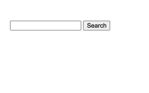
No full-page requests were harmed in the making of this. View the live demo.
We can make the search input field reactive and get rid of the form and search button completely, if we want to, by adding the sprig attribute to the search field. The component will now re-render itself every time the change event of the search input field is triggered (the default trigger for input fields).
<input sprig type="text" name="query" value="{{ query }}">
We can also make it so that the re-render is triggered on keyup events using the s‑trigger attribute.
<input sprig type="text" name="query" value="{{ query }}"
    s-trigger="keyup"
>
The s-trigger attribute also provides us with event modifiers. We’ll use these to only trigger a re-render provided the field value has changed, adding a delay of 300 milliseconds (the amount of time that must pass before issuing a request). A sensible delay (also known as “debounce”) helps to prevent the server from being unnecessarily flooded with AJAX requests.
<input sprig type="text" name="query" value="{{ query }}"
    s-trigger="keyup changed delay:300ms"
>
Since we only really want to replace the search results (and not the search input field), we can target a specific element to swap the re-rendered component into using the s‑target attribute. In this case we will target the inner HTML of <div id="results">. We’ll also want to output the search input field and the results div only when the component is included (on the first render), which we can do by checking that sprig.isInclude evaluates to true.
{# Sets to a default value if not defined #}
{% set query = query ?? '' %}

{% if sprig.isInclude %}
    <input sprig type="text" name="query" value="{{ query }}"
        s-trigger="keyup changed delay:300ms"
        s-target="#results"
    >

    <div id="results"></div>
{% endif %}

{% if query %}
    {% set entries = craft.entries()
        .search(query)
        .orderBy('score')
        .all()
    %}
    {% for entry in entries %}
        {{ entry.title }}
   {% endfor %}
{% endif %}
An easier way of achieving the same result is to use the s‑replace attribute to specify which element to replace. The search input field will still be output in the response HTML, but only the inner HTML of <div id="results"> will be replaced with the new version of itself.
{# Sets to a default value if not defined #}
{% set query = query ?? '' %}

    <input sprig type="text" name="query" value="{{ query }}"
        s-trigger="keyup changed delay:300ms"
        s-target="#results"
    >

<div id="results">
    {% if query %}
        {% set entries = craft.entries()
            .search(query)
            .orderBy('score')
            .all()
        %}
        {% for entry in entries %}
            {{ entry.title }}
        {% endfor %}
    {% endif %}
</div>

View the live demo.
Component Variables #
When creating a new component, you can pass it one or more variables that will become available in the template, as an object in the second parameter.
{# Creates a component from the template path #}
{{ sprig('_components/search', {
    query: 'Wally',
}) }}
Only primitive data types can be used as values: strings, numbers, booleans and arrays. Objects, models and elements cannot be used. If you want to pass an element (or set of elements) into a Sprig component then you should pass in an ID (or array of IDs) instead and then fetch the element from within the component.
{# Passes an entry ID into the component #}
{{ sprig('_components/entry', {
    entryId: 1,
}) }}

{# Passes an array of entry IDs into the component #}
{{ sprig('_components/entries', {
    entryIds: [1, 2, 3],
}) }}
{#-- _components/entry.twig --#}

{% set entry = craft.entries.id(entryId).one() %}
{#-- _components/entries.twig --#}

{% set entries = craft.entries.id(entryIds).all() %}
Note that any variables passed into a Sprig component will be visible in the source code in plain text, so you should avoid passing in any sensitive data.
If you want to pass a variable into the component that cannot be modified or tampered with, prefix it with an underscore. It will still be readable but it will also be hashed so that it cannot be deliberately modified by users without an exception being thrown.
{# Creates a component with a protected variable #}
{{ sprig('_components/search', {
    _section: 'news',
}) }}
Request parameters (query string and body parameters) are automatically available in your components, provided they do not begin with an underscore.
{# The query string `?query=Wanda` is provided in the URL #}

{# Sets to a default value if not defined #}
{% set query = query ?? '' %}

Search results for “{{ query }}”

{# Outputs: Search results for “Wanda” #}
The following component will output entries, offset by and limited to the provided values (initially 0 and 1). Since the _limit variable is prefixed with an underscore, it cannot be tampered with.
{#-- main.twig --#}

{# Creates a component from the template path #}
{{ sprig('_components/load-more', {
    offset: 0,
    _limit: 1,
}) }}
{#-- _components/load-more.twig --#}
{% set entries = craft.entries.offset(offset).limit(_limit).all() %}
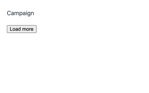
{% for entry in entries %}
<p>{{ entry.title }}</p>
{% endfor %}
{% if entries %}
<div id="replace">
<input type="hidden" name="offset" value="{{ offset + _limit }}">
<button sprig
s-target="#replace"
s-swap="outerHTML"
>
Load more
</button>
</div>
{% endif %}
We’ve used a div with an ID of replace, which we use as the target to load more entries into. In it, we put a hidden input field in which we can increment the offset by the limit value, as well as a load more button that targets its parent element. We set the s‑swap attribute on the button to outerHTML to ensure that the entire div is replaced (by default only the inner HTML is). We’ve wrapped the div in a conditional so it will be output only if entries are found.
An alternative way of dynamically adding or modifying parameters in our components is to use the s‑vals attribute (it expects a JSON encoded list of name-value pairs). This differs from using an input field because it will be submitted with the request only when the button element is clicked.
<button sprig
    s-vals="{{ { offset: offset + _limit }|json_encode }}"
    s-target="this"
    s-swap="outerHTML"
>
  Load more
</button>
The s‑val:* attribute provides a more readable way of populating the s-vals attribute. Replace the * with a lower-case name (in kebab-case, dashes will be removed and the name will be converted to camelCase).
<button sprig
    s-val:offset="{{ offset + _limit }}"
    s-target="this"
    s-swap="outerHTML"
>
    Load more
</button>
View the live demo.
A more complex load more example is available in this cookbook recipe.
Component Attributes #
When creating a new component, you can assign it one or more attributes, as a hash in the third parameter. Attributes beginning with s- can be used to apply logic to the component element itself.
{{ sprig('_components/search', {}, {
    'id': 'search-component',
    's-trigger': 'load, refresh',
}) }}
The example above makes it possible to trigger the component to refresh itself on load, as well as whenever we use the sprig.triggerRefresh function, or manually trigger a refresh event using JavaScript.
Components are assigned a trigger called
refreshby default, which can be overridden using thes-triggerattribute as in the example above.
{# Using Twig #}
{% do sprig.triggerRefresh('#search-component') %}

{# Using JavaScript #}
{% js %}
    htmx.trigger('#search-component', 'refresh');
{% endjs %}
Watch the CraftQuest livestream on how to use Sprig to inject dynamic content into statically-cached pages.
Component State #
Since a component can be re-rendered at any time, it is important to understand that its state (the variables available to it) can also change at any time. The variables available in a component are determined as follows (values defined later take precedence):
- Component variables passed in through the
sprig()function. - The values of all request parameters (query string and body parameters).
- The values of all
inputfields (includingtextareaandselectfields), if the component is re-rendered. - The values of
s-val:*ands-valsattributes on the triggering element (as well as on all its surrounding elements), if the component is re-rendered. - Template variables defined by Craft, plugins and controller actions.
If you want a variable to persist across multiple requests then you can achieve this by adding a hidden input field anywhere inside the component.
{# Limit will always be set to `10` %}
{{ hiddenInput('limit', 10) }}

{# Page will always be set to the previous value, or `1` if undefined %}
{{ hiddenInput('page', page ?? 1) }}
Controller Actions #
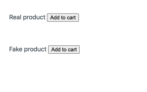
We can call Craft as well as plugin/module controller actions using the s‑action attribute. Let’s take the example of an “add to cart” form (similar to the one shown in the Commerce docs).
<form method="post">
    <input type="hidden" name="action" value="commerce/cart/update-cart">
    {{ csrfInput() }}
    <input type="hidden" name="purchasableId" value="{{ variant.id }}">
    <input type="submit" value="Add to cart">
</form>
To make this a reactive component, we’ll add the sprig attribute to the form, as well as the s‑method and s‑action attributes. Since this is a POST request, Sprig will take care of adding the CSRF token for us, so we can adjust our form as follows.
<form sprig s-method="post" s-action="commerce/cart/update-cart">
    <input type="hidden" name="purchasableId" value="{{ variant.id }}">
    <input type="submit" value="Add to cart">
</form>
Next, let’s add an appropriate message on submission. The update-cart action will result in either a success or an error, which we can test with sprig.isSuccess and sprig.isError respectively. If either is truthy, we can output the resulting message using sprig.message.
<form sprig s-method="post" s-action="commerce/cart/update-cart">
    <input type="hidden" name="purchasableId" value="{{ variant.id }}">
    <input type="submit" value="Add to cart">
</form>

{% if sprig.isSuccess %}
  <p class="notice">
    {{ sprig.message }}
  </p>
{% elseif sprig.isError %}
  <p class="notice error">
    {{ sprig.message }}
  </p>
{% endif %}
Some controller actions return a variable called errors (set to an array of error messages if defined), however each action may return different variables according to its response.
{% if sprig.isError %}
    {% if errors is defined %}
        {% for error in errors %}
            <p class="error">{{ error|first }}</p>
        {% endfor %}
    {% endif %}
{% endif %}
Triggers #
Any HTML element can be made reactive by adding the sprig attribute to it inside of a component. By default, the “natural” event of an element will be used as the trigger:
input,textareaandselectelements are triggered on thechangeevent.formelements are triggered on thesubmitevent.- All other elements are triggered on the
clickevent.
If you want to specify different trigger behaviour, use the s‑trigger attribute.
<div sprig s-trigger="mouseenter">
    Mouse over me to re-render the component.
</div>
If you want a trigger to only happen once, you can use the once modifier for the trigger.
<div sprig s-trigger="mouseenter once">
    Mouse over me to re-render the component only once.
</div>
Triggers are very powerful and essential to understanding how to do more complex things with Sprig. View all of the available trigger events and modifiers.
Component Classes #
In the examples above, we passed a template path into the sprig() function, which created a component directly from that template. If you want to have more control over the component and be able to use PHP logic then you can create a Component class.
Watch the CraftQuest livestream on Sprig Components as PHP Classes.
First, create a new folder called sprig/components in your project’s root directory. This is where your Component classes should be created. In order for our Component classes to be autoloaded, we need to add the following to the project’s composer.json file.
  "autoload": {
    "psr-4": {
      "sprig\\components\\": "sprig/components/"
    }
  },
Running composer dump will regenerate the optimized autoload files for us.
Let’s create a file called ContactForm.php for our base component.
<?php
namespace sprig\components;

use putyourlightson\sprig\base\Component;

class ContactForm extends Component
{
}
In most cases, you’ll want the component to render a template. This can be done by setting a protected property $_template to the template path. All of the public properties of the class will be automatically be available as variables in the template.
<?php
namespace sprig\components;

use putyourlightson\sprig\base\Component;

class ContactForm extends Component
{
    protected ?string $_template = '_components/contact-form';

    public bool $success = false;
    public string $error = '';
    public string $email = '';
    public string $message = '';

    public function send(): void
    {
        $this->success = SomeEmailApi::send([
            'email' => $this->email,
            'message' => $this->message,
        ]);

        if (!$this->success) {
            $this->error = SomeEmailApi::getError();
        }
    }
}
We added a send action as a public method in our class which we can call using the s-action attribute.
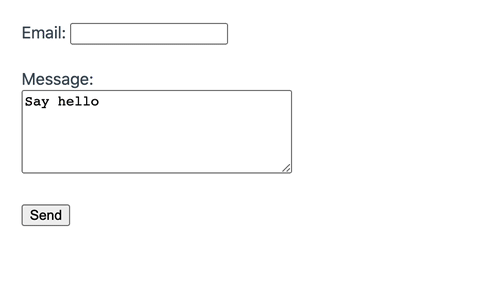
{#-- _components/contact-form --#}

{% if success %}
    Thank you for getting in touch!
{% else %}
    {% if error %}
        <p class="error">{{ error }}</p>
    {% endif %}

    <form sprig s-action="send">
        <input type="email" name="email" value="{{ email }}">
        <input type="text" name="message" value="{{ message }}">
    </form>
{% endif %}
If you prefer then you can override the render method which will be called each time the component is rendered.
public function render(): string
{
    return 'Contact us by email at [email protected]';
}
Now we can create the component from our ContactForm class as follows, passing in any variables as before.
{#-- main.twig --#}

{# Creates a component from the ContactForm class  #}
{{ sprig('ContactForm', {
    message: 'Say hello',
}) }}
View the live demo.
Security Considerations #
Any variables passed into a Sprig component will be visible in the source code in plain text, so you should avoid passing in any sensitive data. Variables can also be overridden (unless prefixed it with an underscore) by manipulating the query string and source code, so you should validate that a variable value is allowed if it could lead to revealing sensitive data.
{% set section = section ?? '' %}
{% set allowedSections = ['articles', 'plugins'] %}

{% if section not in allowedSections %}
    This section is not allowed.
{% else %}
    {% set entries = craft.entries.section(section).all() %}
%}
The code above will only fetch the entries in the provided section if it is either articles or plugins. This avoids the possibility that someone could change section to secrets and gain access to entries that should not be visible. See an example using protected variables here.
Since variables can contain user input, you should be aware of the risk of introducing a Cross-Site Scripting (XSS) vulnerability into your code. Variables output by Twig are automatically escaped, but you should always ensure that your HTML attribute values are wrapped in quotes and that you escape any variables that are output inside of script tags using the JavaScript escape filter.
{# It is unsafe to omit quotes, do NOT do this! #}
<div s-val:name={{ name }}>

{# It is safe to use either double or single quotes. #}
<div s-val:name="{{ name }}">
<div s-val:name='{{ name }}'>

{% js %}
    {# Escape for JavaScript. #}
    console.log('{{ name|escape('js') }}');
{% endjs %}
Live Demos #
For more real-world examples of using Sprig with Craft, check out the Sprig Cookbook.
Playground #
Sprig comes with a playground that is available in the control panel. The playground allows you to quickly experiment with a default Sprig component, as well as create and save your own.
Component variables can be passed in separated by ampersands, for example count=0&limit=5. The playground can be disabled on a per environment basis using the enablePlayground config setting.

Htmx #
Sprig requires and uses htmx (~10 KB gzipped) under the hood, although it tries to remain as decoupled as possible by not providing any JavaScript code of its own.
Listen to devMode.fm podcast on htmx.
Anything you can do with hx- attributes you can also do with s- and sprig- attributes. If you insist on having valid HTML then you can prefix all Sprig attributes with data- (data-sprig, data-s-action, etc.). See the full attribute reference.
Sprig automatically loads the htmx library whenever a component is created. If you prefer to host the JavaScript file in a specific location, or use a CDN, then you can load htmx.min.js using a regular script tag. This tag should ideally be placed inside of a layout template so that it will be included in every page of the site that requires it.
{# Disable automatic registering and loading of the htmx script. #}
{% do sprig.setRegisterScript(false) %}

{# Load the required file manually from a specific path or CDN. #}
<script src="/path/to/htmx.min.js" defer></script>
{# Disable automatic registering and loading of the htmx script. #}
{% do sprig.setRegisterScript(false) %}

{# Load the required file manually from a specific path or CDN. #}
<script src="/path/to/htmx.min.js" defer></script>
You can download and host the htmx source code on your own server or install the package using npm.
npm install htmx.org
The drawback to this approach is that you’ll need to manually update htmx and ensure that you use the same version that Sprig uses.
JavaScript #
You can execute JavaScript code in your components using the sprig.registerJs function.
{% do sprig.registerJs('console.log("hello")') %}
Be careful when outputting variables that could include user input inside script tags as this can lead to XSS vulnerabilities (see security considerations). Ideally you should escape all variables using the |escape('js') (or e|('js')) filter.
{% set js %}
   console.log('{{ message|escape('js') }}');
{% endset %}
{% do sprig.registerJs(js) %}
The htmx JavaScript API provides a simplified way of performing common tasks. The code below shows how to trigger the refresh event on an element with ID search-component using the htmx JS API.
{% set js %}
    htmx.trigger('#search-component', 'refresh'));
{% endset %}
{% do sprig.registerJs(js) %}
Alternatively, you can use a htmx event such as htmx:afterSwap to run a function after a component is re-rendered and swapped into the DOM. Your JavaScript code should be loaded using the {% js %} tag to ensure that htmx is loaded first. The following code should be placed in the parent template.
{% js %}
    htmx.on('htmx:afterSwap', function(event) {
        // do something
    });
{% endjs %}
If your JavaScript code exists in a separate file then you should defer the loading of it to ensure that htmx is loaded first.
{% js '/assets/js/script.js' with {
    defer: true
} %}
Alpine.js #
If using Alpine.js, you should always opt to use inline directives over runtime declarations, for example use x‑data over Alpine.data.
{# Do this. #}
<div x-data="{ open: false, toggle() { this.open = !this.open } }">
    <button x-on:click="toggle">Toggle Content</button>
    <div x-show="open">
        Content...
    </div>
</div>
{# DON'T do this! #}
<div x-data="dropdown">
    <button x-on:click="toggle">Toggle Content</button>
    <div x-show="open">
        Content...
    </div>
</div>
<script>
    document.addEventListener('alpine:init', () => {
        Alpine.data('dropdown', () => ({
            open: false,
            toggle() {
                this.open = !this.open
            },
        }))
    })
</script>
Alpine’s Persist plugin may be useful for persisting Alpine state across component re-renders, in addition to page loads.
<div x-data="{ count: $persist(0) }">
    <button x-on:click="count++">Increment</button>
    <span x-text="count"></span>
</div>
<button sprig>Refresh</button>
Handling HTTP Errors #
If the server responds with an HTTP error (a 404 or a 501, for example) then the Sprig component will not be refreshed and it will appear to the user that nothing happened. Fortunately, htmx triggers a htmx:responseError event that you can gracefully handle to display an error message to the user.
<div id="error" class="hidden">
   An error occurred.
</div>
The following code should be placed in the parent template.
{% js %}
    htmx.on('htmx:responseError', function(event) {
        htmx.toggleClass('#error', 'hidden');
    });
{% endjs %}
Attributes #
Sprig makes the following HTML attributes available. Some are specific to Sprig while others map directly to hx- attribute equivalents in htmx. See the full attribute reference.
Sprig attribute autocomplete support is available in IDEs via the JetBrains plugin and Visual Studio Code extension.
s-action #
Sends an action request to the provided controller action.
<form sprig s-action="plugin-handle/controller/action">
Most controller actions require that the method be set to post and result in either a success or an error, which can be tested using sprig.isSuccess and sprig.isError respectively. If either is truthy, we can output the resulting message using sprig.message.
<form sprig s-method="post" s-action="commerce/cart/update-cart">
    <input type="hidden" name="purchasableId" value="{{ variant.id }}">
    <input type="submit" value="Add to cart">
</form>

{% if sprig.isSuccess %}
    Product added to your cart!
{% elseif sprig.isError %}
    Error: {{ sprig.message }}
{% endif %}
s-boost #
Boosts normal anchors and form tags to use AJAX instead.
s-cache #
Allows you to specify if and for how long in seconds a request should be cached locally in the browser (defaults to 300 seconds if not specified).
<div sprig s-cache>Show details</div>
<div sprig s-cache="60">Show details</div>
s-confirm #
Shows a confirm() dialog before issuing a request.
<button sprig s-confirm="Are you sure you wish to delete this entry?">Delete</button>
Attribute reference »
Cookbook recipe »
s-disable #
Disables htmx processing for an element and its children. Useful for prevent malicious scripting attacks when you output untrusted user-generated content that may contain HTML tags (see htmx security).
<div s-disable>
    {{ entry.untrustedContent }}
<div>
s-disabled-elt #
Allows you to specify elements that will have the disabled attribute added to them for the duration of the request.
<button sprig s-disabled-elt="this">Submit<button>
s-disinherit #
Allows you to control attribute inheritance.
s-encoding #
Allows you to change the request encoding from the usual application/x-www-form-urlencoded to multipart/form-data, useful for when you want to support file uploads.
<form sprig s-method="post" s-action="entries/save-entry" s-encoding="multipart/form-data">
s-ext #
Enables an htmx extension for an element and all its children.
s-headers #
Allows you to add to the headers that will be submitted with a Sprig request.
s-history #
Allows you to prevent sensitive data being saved to the localStorage cache when taking a snapshot of the page state.
s-history-elt #
Allows you to specify the element that will be used to snapshot and restore page state during navigation.
s-include #
Allows your to specify the element values to submit in Sprig requests. This can be useful when you have nested components inside a parent component, and you want to prevent elements inside the nested components being submitted when the parent component is refreshed.
By default, the entire component is used for the value of s-include but you can place it on an element in your component to limit which element values are submitted.
<div s-include="this">
    {# Filter elements #}
</div>

{# Nested components #}
s-indicator #
The element to put the htmx-request class on during a Sprig request.
s-listen #
Allows you to specify one or more components (as CSS selectors, separated by commas) that when refreshed, should trigger a refresh on the current element. This attribute is most commonly placed on a component using the third parameter of the sprig function.
{{ sprig('_components/products', {}, {'id': 'products'}) }}

{# This component is refreshed each time the `#product` component is refreshed. #}
{{ sprig('_components/cart', {}, {'s-listen': '#products'}) }}

{# Equivalent to: #}
{{ sprig('_components/cart', {}, {'s-trigger': 'htmx:afterOnLoad from:#products'}) }}
s-method #
Forces the request to be of the type provided. Possible values are get (default) post or any valid HTTP verb. If set to something other than get, Sprig automatically sends a CSRF token in the request.
<form sprig s-method="post">
s-on:* #
Allows you to respond to events directly on an element.
<div s-on:click="htmx.toggleClass('#more', 'hidden')">Show/hide more</div>
s-params #
Filters the parameters that will be submitted with a request.
s-preserve #
Ensures that an element remains unchanged even when the component is re-rendered. The value should be set to true and the element must have an id.
<select id="datepicker" s-preserve="true"></select>
Some elements, such as text input fields (focus and caret position are lost), iframes or certain types of videos, cannot be entirely preserved. For such cases you can use the morphdom extension.
s-prompt #
Shows a prompt before submitting a request.
<button sprig s-prompt="Enter “delete” to confirm deletion.">Delete</button>
s-push-url #
Pushes a URL into the URL bar and creates a new history entry.
Attribute reference »
Cookbook recipe »
s-replace #
Specifies the element to be replaced. The entire component is returned in the response, but only the specified element is replaced. This is equivalent to combining s-select, s-target and s-swap.
<input name="query" sprig s-replace="#results">

{# Equivalent to: #}
<input name="query" sprig s-select="#results" s-target="#results" s-swap="outerHTML">
s-replace-url #
Allows you to replace the current URL of the browser location history.
s-request #
Allows you to configure various aspects of the request.
s-select #
Selects a subset of the server response to process.
Attribute reference »
Cookbook recipe »
s-select-oob #
Selects one or more elements from a server response to swap in via an “Out of Band” swap.
s-swap #
Controls how the response content is swapped into the DOM (outerHTML, beforeEnd, etc.).
<input name="query" sprig s-swap="outerHTML" s-target="#results">
Attribute reference »
Cookbook recipe »
s-swap-oob #
Marks content in a response as being “Out of Band”, i.e. swapped somewhere other than the target.
Attribute reference »
Cookbook recipe »
s-sync #
Allows you to synchronize Sprig requests between multiple elements.
s-target #
Specifies the target element to be swapped.
<input name="query" sprig s-target="#results">
Attribute reference »
Cookbook recipe »
s-trigger #
Specifies the event that triggers the request.
<input name="query" sprig s-trigger="keyup changed delay:300ms">
Attribute reference »
Cookbook recipe »
s-val:* #
Provides a more readable way of populating the s-vals attribute. Replace the * with a lower-case name.
<button sprig s-val:page="{{ page + 1 }}" s-val:limit="10">Next</button>

{# Equivalent to: #}
<button sprig s-vals="{{ { page: page + 1, limit: 10 }|json_encode }}">Next</button>
Since HTML attributes are case-insensitive, the name should always be lower-case and in kebab-case. Dashes will be removed and the name will be converted to camelCase when the variable becomes available in the template after re-rendering.
{% set myCustomPage = myCustomPage ?? '' %}

<button sprig s-val:my-custom-page="13">Custom Page</button>
s-validate #
Forces an element to validate itself before it submits a request. Form elements do this by default, but other elements do not.
s-vals #
Adds to the parameters that will be submitted with the request. The value must be a JSON encoded list of name-value pairs.
<button sprig s-vals="{{ { page: page + 1, limit: 10 }|json_encode }}">Next</button>
s-vars #
The
s-varsattribute has been deprecated for security reasons. Use the more secure s‑vals or s‑val:* instead.The expressions in
s-varsare dynamically computed which allows you to add JavaScript code that will be executed. While this is a powerful feature, it can lead to a Cross-Site Scripting (XSS) vulnerability if user input is included in expressions. If you absolutely require dynamically computed expressions then use hx-vars directly.
Adds to the parameters that will be submitted with the request. The value must be a comma-separated list of name-value pairs.
<button sprig s-vars="page: {{ page + 1 }}, limit: 10">Next</button>
Template Variables #
Sprig provides the following template variables.
sprig.getHtmxVersion() #
Returns the htmx version used by the current version of Sprig.
{{ sprig.htmxVersion }}
sprig.getMessage() #
Returns the message resulting from a request.
{% if sprig.message %}
  <p class="notice">
    {{ sprig.message }}
  </p>
{% endif %}
sprig.getModelId() #
Returns the model ID resulting from a request.
sprig.getPrompt() #
Returns the value entered by the user when prompted via s‑prompt.
sprig.getTarget() #
Returns the ID of the target element.
sprig.getTrigger() #
Returns the ID of the element that triggered the request.
sprig.getTriggerName() #
Returns the name of the element that triggered the request.
sprig.getUrl() #
Returns the URL that the Sprig component was loaded from.
sprig.isBoosted #
Returns true if this is in response to a boosted request (hx-boost).
sprig.isError #
Returns whether this is an error request.
{% if sprig.isError %}
  <p class="notice error">
    {{ sprig.message }}
  </p>
{% endif %}
sprig.isHistoryRestoreRequest #
Returns true if the request is for history restoration after a miss in the local history cache a client-side redirect without reloading the page.
sprig.isInclude #
Returns true if the template is being rendered on initial page load (not through a Sprig request), otherwise, false.
{% if sprig.isInclude %}
    Template rendered on initial page load
{% else %}
    Template rendered through a Sprig request
{% endif %}
sprig.isRequest #
Returns true if the template is being rendered through a Sprig request (not on initial page load), otherwise, false.
{% if sprig.isRequest %}
    Template rendered through a Sprig request
{% else %}
    Template rendered on initial page load
{% endif %}
sprig.isSuccess #
Returns whether this is a success request.
{% if sprig.isSuccess %}
  <p class="notice">
    {{ sprig.message }}
  </p>
{% endif %}
sprig.location(url) #
Triggers a client-side redirect without reloading the page.
{% do sprig.location('/page' ~ page) %}
sprig.paginate(query, page) #
Paginates a query and returns a variable (that extends Craft’s Paginate variable) that contains the current page results and information.
The sprig.paginate method accepts a query (an element query or an active query) and a page number (defaults to 1) and returns a variable that provides the following properties and methods:
pageInfo.pageResults– The element results for the current page.pageInfo.first– The offset of the first element on the current page.pageInfo.last– The offset of the last element on the current page.pageInfo.total– The total number of elements across all pagespageInfo.currentPage– The current page number.pageInfo.totalPages– The total number of pages.pageInfo.getRange(start, end)– Returns a range of page numbers as an array.pageInfo.getDynamicRange(max)– Returns a dynamic range of page numbers that surround (and include) the current page as an array.
{% set query = craft.entries.limit(10) %}
{% set pageInfo = sprig.paginate(query, page) %}

{% set entries = pageInfo.pageResults %}

Showing {{ pageInfo.first }} to {{ pageInfo.last }} of {{ pageInfo.total }} entries.
Showing page {{ pageInfo.currentPage }} of {{ pageInfo.totalPages }}.
sprig.pushUrl(url) #
Pushes the URL into the URL bar and creates a new history entry.
{% do sprig.pushUrl('?page=' ~ page) %}
sprig.redirect(url) #
Forces the browser to redirect to the URL.
{% do sprig.redirect('/new/page') %}
sprig.refresh() #
Forces the browser to refresh the page.
{% do sprig.refresh() %}
sprig.registerJs(js) #
Registers JavaScript code to be executed in the current request. This function takes care of registering the code in the appropriate way depending on whether it is part of an include or a request.
{# Single line usage #}
{% do sprig.registerJs('console.log("hello")') %}

{# Multi-line usage #}
{% set js %}
    console.log('hello, {{ name }}')
{% endset %}
{% do sprig.registerJs(js) %}
sprig.registerScript #
Registers and load the htmx script. This is only necessary to manually call if the script is not automatically registered (if sprig.setRegisterScript(false) has been called, for example), or if you want to ensure that htmx is loaded on a page, regardless of whether or not it contains a Sprig component.
{% do sprig.registerScript %}
sprig.replaceUrl(url) #
Replaces the current URL in the location bar.
{% do sprig.replaceUrl('/page' ~ page) %}
sprig.reswap(value) #
Allows you to change the swap behaviour.
{% do sprig.reswap('outerHTML') %}
sprig.retarget(target) #
Overrides the target element via a CSS selector.
{% do sprig.retarget('#results') %}
sprig.script #
The
sprig.scripttag has been deprecated. The htmx script is now automatically injected into the end of the page whenever a Sprig component is created, meaning that thesprig.scripttag is no longer required and can be safely removed.
sprig.setConfig(options) #
Allows you to set configuration options for htmx (via a meta tag).
{% do sprig.setConfig({ requestClass: 'loading' }) %}
sprig.setRegisterScript(value) #
Allows you to set whether Sprig should automatically register and load htmx whenever a component is created (defaults to true). The value can either be a boolean or an array of options (see all available options).
{# Disables automatically loading the htmx script. #}
{% do sprig.setRegisterScript(false) %}

{# Loads the htmx script at the beginning of the document body. #}
{% do sprig.setRegisterScript({ position: constant('craft\\web\\View::POS_BEGIN') }) %}
sprig.swapOob(target, templatePath, variables) #
Swaps a template out-of-band. This can be used on a Sprig component or any target element matching the CSS selector. The variables parameter is an optional array of variables to pass into the template. Cyclical requests are mitigated by prevented the swapping of unique components multiple times in the current request, including the initiating component.
{% do sprig.swapOob('#myComponent', 'path/to/template') %}

{% do sprig.swapOob('#myComponent', 'path/to/template', { query: query }) %}
Watch the livestream in which the
swapOobfunction was discussed.
sprig.triggerEvents(events) #
Triggers one or more client-side events. The events parameter can be an array of events, one or more comma-separated events as a string, or a JSON encoded string of key-value pairs.
{% do sprig.triggerEvents(['eventA', 'eventB']) %}

{% do sprig.triggerEvents('eventA, eventB') %}

{% do sprig.triggerEvents('{"eventA":"Value A","eventB":"Value B"}') %}
sprig.triggerRefresh(target, variables) #
Triggers a refresh on a Sprig component. The target is a CSS selector and the variables parameter is an optional array of variables to inject into the component before refreshing it. Cyclical requests are mitigated by prevented the triggering of unique components multiple times, including the initiating component.
{% do sprig.triggerRefresh('#myComponent') %}

{% do sprig.triggerRefresh('#myComponent', { query: query }) %}
Watch the livestream in which the
triggerRefreshfunction was discussed.
sprig.triggerRefreshOnLoad(selector) #
Triggers a refresh of the Sprig components matching the selector or all components (using the default selector .sprig-component) on page load. This is useful when statically caching pages to avoid CSRF requests failing on the first cached request, see this issue for details.
{{ sprig.triggerRefreshOnLoad() }}
Control Panel Usage #
The Sprig Core module provides the core functionality for the Sprig plugin. If you are developing a Craft custom plugin or module and would like to use Sprig in the control panel, then you can require this package to give you its functionality, without requiring that the site has the Sprig plugin installed.
First require the package in your plugin/module’s composer.json file.
{
    "require": {
        "putyourlightson/craft-sprig-core": "^2.0"
    }
}
Then bootstrap the Sprig module from within your plugin/module’s init method.
use craft\base\Plugin;
use putyourlightson\sprig\Sprig;

class MyPlugin extends Plugin
{
    public function init(): void
    {
        parent::init();

        Sprig::bootstrap();
    }
}
You can then use the Sprig function and tags as normal in your control panel templates.
Acknowledgements #
This plugin stands on the shoulders of giants.
- Inspired by Laravel Livewire.
- JavaScript goodness provided by htmx.
- Built for the excellent Craft CMS.
Special thanks goes out to Andrew Welch (nystudio107) and to Z (you know who you are) for being a source of valuable input.
Have a suggestion to improve the docs? Create an issue with details, and we'll do our best to integrate your ideas.