Responsive CP is an ExpressionEngine theme that I started working on over a year ago but that I only released to the public as a free add-on last week. You may have already noticed it in the various screenshots of our add-ons. The theme has two main goals – to provide a more professional looking control panel and to work well on desktop as well as mobile devices with small to medium screen sizes.
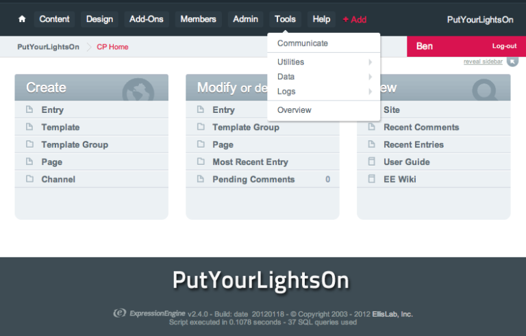
The look and feel of the control panel has been made more professional by decreasing the radius of those excessive rounded corners, improving contrast and colours and generally tidying up elements. Media queries are used to tweak the control panel based on the following screen sizes, making it responsive to the device used:
- Tablet in portrait mode (768 pixels wide)
- Phone in landscape mode (480 pixels wide)
- Phone in portrait mode (320 pixels wide)
Although it is possible to use an override.css file to customise the theme, Responsive CP was built as an accessory so that it can be switched on and off from the control panel and so that it can be used to display a logo at the bottom of the screen. This add-on is still in experimental mode and I will be listening to your comments and feedback on how I can improve it.
Please also consider leaving a review if you like it.