Lately I’ve become more aware of a pattern that seems to be quite common among software within the ExpressionEngine community, and it not only appears within third-party add-ons but stems all the way from the core product itself.
The pattern is that a right-of point release, for example 2.x, is quickly followed by a flurry of panicky bug reports and support requests. It is generally followed swiftly by a 2.x.1 release which fixes the major bugs and resolves the critical issues discovered by the software’s user base. Subsequently a 2.x.2 version is released to cover any remaining issues that were overlooked and patch any security holes.
This is not a criticism of ExpressionEngine, so please don’t take it that way, it is simply a pattern that seems to be quite widespread and natural within our industry. I myself have experienced this first-hand with my commercial add-ons and recently had the idea of putting together a little graph that would show this release trend in my add-ons.
Originally I wanted to create a graph of how I “imagined” support requests would jump in volume right after a major release and slowly decrease as minor versions were released to address issues. But my love of data visualisations told me that I should do some actual research to collect real data and accurately visualise it on an graph.
So I ended up writing some PHP code that would scrape all of the support requests I have received for my add-ons on the support forums on devot-ee. By the way, this might be a good opportunity to remind you that as great as hosted third-party services that help you run your business are, they have one major disadvantage and that is that you don’t actually “own” the data that you publish. I’m sure Ryan Masuga would have been happy to help me get the data I needed, but I saw it as a strange challenge of sorts.
So after scraping close to a thousand pages on devot-ee (if you saw a sudden spike in traffic then that was me Ryan!!) I had the data I needed. I threw it into a Google Chart and voila, unrecognisable data instantly beautified into an meaningful visualisation.
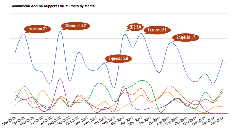
The result is below, and I’ve annotated it with what may be possible explanations of the individual peaks (these are mildly educated guesses). The blue line represents the total number of support forum posts by month over the past 2 years and the coloured lines represent posts for the individual commercial add-ons (Snaptcha, Expresso, FireMail and the Sitemap Module).
At first I just thought of this as a simple experiment but the more I looked at the visualised data, the more I realised that there were insights to be gained from it. So I went back to the data and correlated it with my commercial add-on sales figures and came up with some fascinating visualisations.
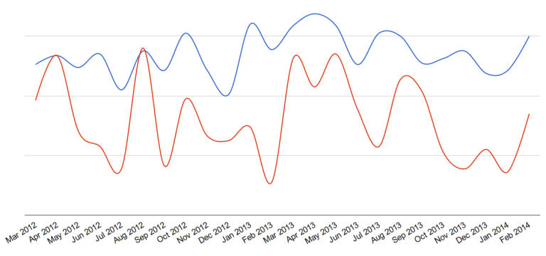
The chart below visualises total sales and support over the past 2 years. The blue line represents the number of add-ons sold and the red line represents the number of support forum posts in any given month.
Even though common sense tells me that this is what I should expect, I was stunned to see just how closely related the lines are. You can see how the peaks and troughs of support forum posts come just after those of sales, and even the Christmas season down-time is visible in both lines.
Conclusion: as add-on sales increase, expect to receive more support requests
The second chart visualises sales and support figures for individual add-ons. The y‑axis represents income from add-ons sales and the x‑axis represents the number of support forum posts per add-on. The size of the bubble represents the price of the add-on.
So as we can see below, the Sitemap Module brings in the largest amount of income and also requires the least amount of support. At the other end of the spectrum, Expresso brings in the least amount of income and requires the most support of all, whereas Snaptcha and FireMail share the middle ground.
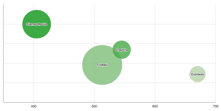
Conclusion: the best selling add-ons are often those that just work and need the least amount of support
I sense that visualising data like this could get quite addictive once you’ve gathered the data. I’m very pleasantly surprised at how insightful these visualisations, as well as others that I have produced, are proving to be, and I hightly recommend visualising your data in order to better understand your business.